How to Read Trading Charts: A Practical Guide


Wondering how to read a stock chart?
At first, it’s just colors, wicks, and numbers that seem to move for no reason. But once you know what to focus on, things can start to make some sort of sense.
In this guide, we’ll cover:
- What price charts can show (and what they don’t)
- The difference between common chart types
- Key signals traders focus on when analyzing price action
Let’s dive in.
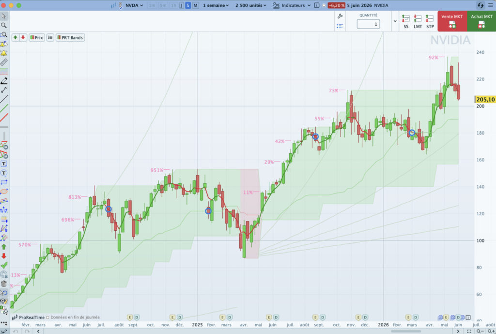
A stock chart shows how price has moved over time — each bar or candle reflects the open, high, low, and close.
Candlestick, bar, and line charts each tell the story differently. Candlesticks are preferred by most active traders for their added detail.
Spotting the trend through highs and lows helps you understand if price is trending, ranging, or losing momentum.
Volume, support and resistance, and candlestick patterns are among indicators that can help you read price action — but even a good read can lead to bad trades. Markets don’t always reward technical traders.
Understanding Price on a Chart
A stock chart shows how price has moved over time. It reflects the ongoing battle between buyers and sellers and gives you a sense of how strong each move was.
- The horizontal axis shows time.
- The vertical axis shows price.

But what the chart actually shows, and how useful it is, depends on two key settings you control.
You’ll usually pick:
- The timeframe: how much time each candle or bar represents (Minutes, hours, days)
- The number of periods: how many candles or bars you display (100, 1000, 10000)
The same chart can look completely different depending on those two settings. A 1-minute chart with 100 candles will show just under two hours of market activity.
A daily chart with 100 candles? That’s more than 3 months of price data.

The timeframe you pick depends on how you trade. If you’re scalping or day trading, you’ll likely use short timeframes like 1-minute or 5-minute charts.
If you’re swing trading or investing, you’re most likely to rely on daily or weekly charts to see broader trends.
Some active traders go one step further and use tick charts.These don’t care about time at all. Instead, they create a new candle after every X trades (e.g. 25 ticks). This gives a view of pure trading activity.

No matter which chart type or timeframe you choose, each bar or candle is a snapshot of price movement over that time period or tick interval.
It captures where price started, how far it traveled, and where it ended — all in a single visual.
And it all comes down to four key price points:
| Price | What it means |
|---|---|
| Open (O) | Where the price was at the start of the time period |
| Close (C) | Where it ended at the close of the period |
| Low (L) | The lowest price reached during that time |
| High (H) | The highest price reached during that time |
How that price data is displayed depends on whether you’re looking at a line, bar, or candlestick chart.
Some just show where price closed. Others reveal a fuller picture — highs, lows, momentum shifts — giving you a better sense of market sentiment.
Let’s take a closer look at how each chart type may affect your read on the market
Candlestick charts
Candlestick charts are the default view for most active traders because they show a lot at a glance. They display the four price levels in a way that’s easier to scan.

Each candle captures what price did during a specific period, and more importantly, how it did it. A green candle means buyers were in control; a red one means sellers took over.

You can quickly see how far price moved and how strong that move was , just by looking at the size of the candlestick body or the length of the wick.

- The body shows the distance between the open and close. Its color tells you if price rose or fell; its size shows how strong the move was.
- The wicks (also called shadows) show the extremes, the highest and lowest prices reached during that trading period.
It takes a bit of practice to get used to, but once you do, it’s hard to trade without them
Line charts
Line charts connect each closing price with a single line. They’re simple, easy to read, and often used in mobile trading apps. While they don’t show much detail, they’re helpful for getting a quick view of where the price is heading.

This simplicity comes at a cost. Line charts only show the closing price of each period. You won’t see the highs, lows, or how price moved in between.
That’s why active traders rarely use them. For long-term investors or anyone just looking for the broad trend, they still serve a purpose.
Bar charts
Before candlesticks took over, bar charts were the standard for technical traders in the West — especially in the 70s, 80s, and early digital platforms. It’s a compact chart style that shows complete data, though it can take an extra second to interpret at a glance.

A bar chart shows each trading period as a single vertical line. The top of the bar marks the highest price, the bottom marks the lowest, and two small ticks show where the price opened (left) and closed (right).
Some platforms color the bars (green for up, red for down), but unlike candlesticks, the shape stays the same no matter what the price did. You read direction by checking whether the close is above or below the open.
What to Look for on a Stock Chart
Candles and bars are nice to look at. But unless you know what you’re looking at, it’s just noise.
If you’re just getting started, here are the key things to focus on.
1. Trend direction
Before you can do anything with a chart, you need to know which direction price is heading.
Step into a downtrend, and you might be “catching a falling knife.” Jump into an uptrend too late, and the momentum may already be fading.
Some traders — known as trend traders — build their entire trading plan around identifying and following the trend.
They’re not trying to call tops or bottoms. They just ride the wave while it lasts and get out when momentum fades.
Spotting the trend helps you read the market’s current context: Are we in a strong move? Are we consolidating? Is momentum fading?
You don’t need fancy indicators to answer those, use a reliable charting software and, just follow the structure of the highs and lows:
- Uptrend: higher highs and higher lows

- Downtrend: lower highs and lower lows

- Range: price bouncing between support and resistance

Zoom out. A short-term chart might look bullish, but the bigger picture could say otherwise. That one insight alone can keep you from making some of the most common rookie mistakes. Because in trading, it’s not just a saying — the trend really is your friend.
These shifts in direction often play out around key price zones, areas where price tends to stall, reverse, or bounce. Traders call them support (a floor where price holds) and resistance (a ceiling where it struggles to break through).
These levels aren’t always horizontal. When price keeps respecting a rising or falling line, that’s a trendline, essentially a dynamic version of support or resistance. Spotting these areas early can help you avoid buying into a wall… or selling right before a bounce.
2. Volume
Price shows what’s happening. Volume tells you how serious it is.
When volume rises, more participants are stepping in — whether they’re buying, selling, or both. That makes the move more meaningful. When volume dries up, it’s often a sign the market isn’t fully committed.
Volume analysis matters most when price is doing something important, like breaking out of a range, retesting a key level, or pushing into new highs.
In the chart below, notice how volume spikes each time price hits the lower bound of the rising channel. That’s not a breakout — it’s a reaction. And a strong one. It tells us that traders were watching that level closely and stepped in to defend it.

Volume surging at support adds weight to the level. It doesn’t guarantee a bounce, but it shows you that this price zone matters.
What to look for:
- Breakouts with rising volume → more likely to hold.
- Pullbacks with falling volume → less likely to turn into full reversals.
- Sudden volume spikes → may signal key turning points or news-driven moves.
3. Candlestick patterns
Candlesticks don’t just show where price opened and closed. The shape and size of the candle can hint at what’s going on beneath the surface.
These patterns won’t predict the future. But when they show up around support, resistance, or key zones, they can flag potential shifts worth paying attention to.
Rejection wicks

Long wick, small body. Price pushed into a level and got firmly rejected. This often signals hesitation, exhaustion, or a failed breakout attempt.
Engulfing candles

One candle completely engulfs the previous one. When it’s red and follows a green candle, it signals that sellers just overpowered buyers — a possible shift in momentum.
There are many others, like doji, inside bars, and shooting stars. They’re not a perfect science, but in the right context, they can help you read and potentially make sense of what may be happening.
4. Chart patterns
Chart patterns are shapes that price forms over time. They don’t predict the future, but they can hint at exhaustion, continuation, or potential reversals when combined with other context.
Here are some examples:
- Flags and pennants – Small consolidations after a sharp move. A continuation is likely if price breaks in the same direction.
- Triangles – Price gets squeezed between support and resistance. The breakout direction often shows who’s gaining control.
- Double tops and double bottoms – Price fails twice at the same level. That’s a potential turning point.
- Head and shoulders – A three-part structure that can signal a shift in trend after an extended move.
- Cup with handle – A rounded consolidation followed by a breakout. Often seen in bullish setups.
Each of these is covered in more detail in our chart patterns round-up. They’re not foolproof, but they can help you catch potential shifts as they form.
Final thoughts
Learning to read stock charts is one of the most practical skills you can develop as a new trader. It helps you see where price has been, how it’s moving now, and where key decisions are likely happening.
There’s still more to explore — like technical indicators, different timeframes, and how to turn what you see on a chart into an actual trading plan.
Start with the basics. Watch how trends form and break. Notice how price behaves after a breakout or a spike in volume. Don’t just look at what happened — take a moment to ask why it moved that way.
Most chart platforms let you draw trendlines, mark price levels, or leave notes on your screen. Use those tools to test your thinking and track what you’re learning.
And if you’re just getting started, don’t trade with real money yet. Use a paper trading simulator. It gives you space to build experience, spot mistakes early, and get more comfortable reading charts, without the stress of losing capital.
That’s often your best decision as a new trader because, statistically, most day traders are not profitable.

Othmane has been swing trading for years and builds on experience in investment banking. He writes regularly about trading and market analysis, and has passed Level I of the CFA Program along with earning a double Master’s degree in Financial Analysis.
Enjoy free trading practice on
ProRealTime Paper Trading Simulator.