The Most Popular Chart Patterns in 2026

Understanding popular chart patterns is essential for identifying key market price levels and anticipating challenges in your current trading session.
We’ve analyzed and ranked 22 chart patterns, from the most popular to the least known.
Whether they are continuation, reversal, or consolidation patterns, our findings show that no single chart pattern is the best. Learning to recognize these patterns is crucial for improving your technical analysis skills.
1. The double bottom
The double bottom is a bullish reversal pattern that takes the shape of a “W” once it reaches a support level.

This chart pattern demonstrates the waning nature of the initial bearish push, which fails to break through the support level despite two attempts. In the end, a new upward trend emerges.
If prices hit the support level a third time, the pattern is called triple bottom.
2. The double top
The double top is a bearish reversal pattern that takes the shape of an “M” once it reaches the resistance level.
This chart pattern demonstrates the diminishing strength of the initial bullish push, which fails to breach the resistance level despite two attempts, ultimately leading to the emergence of a new downward trend.

If prices hit the resistance level a third time, the pattern is called a triple top.
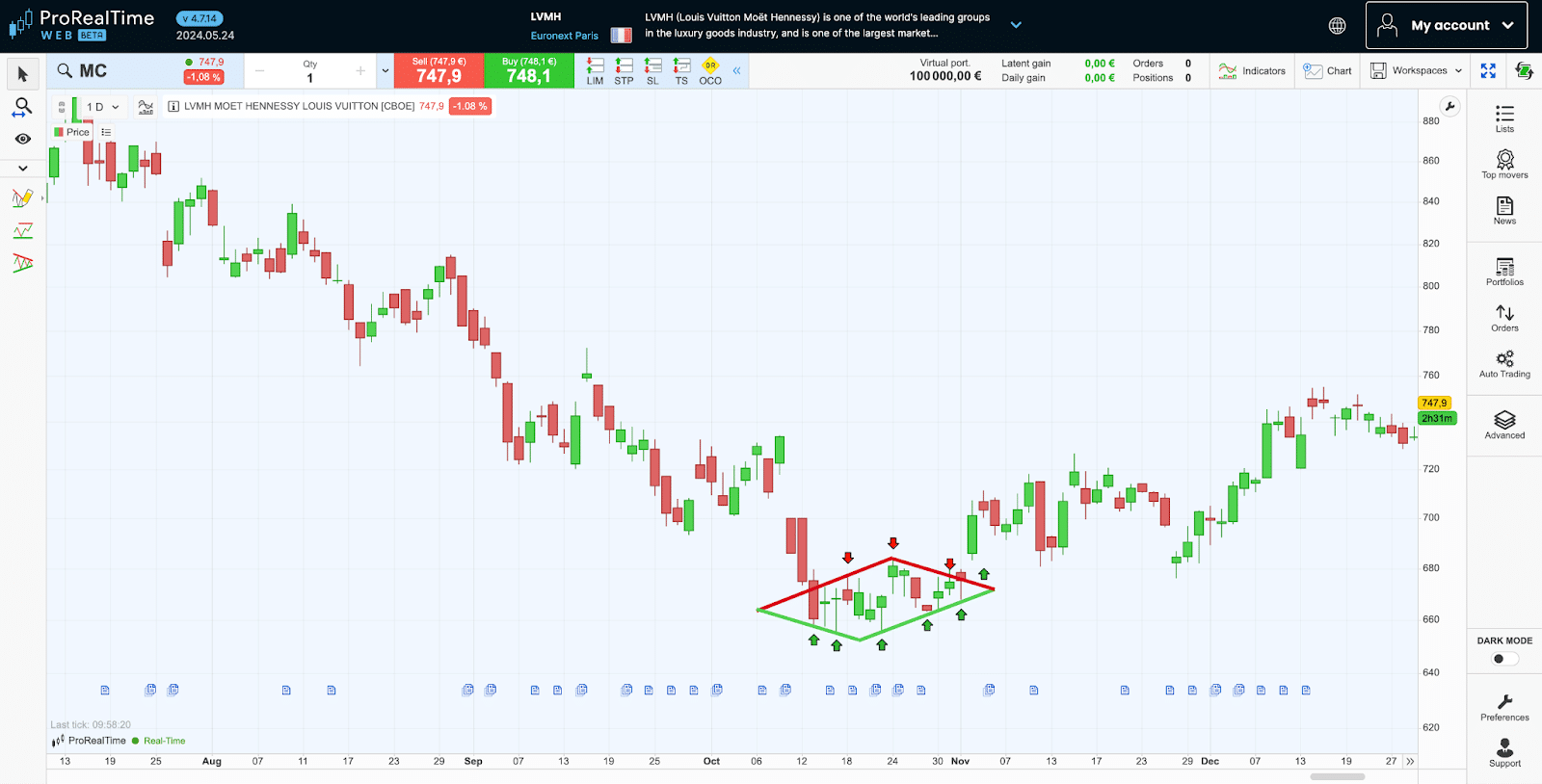
3. The range
The range is a continuation pattern where the price is stuck between the support and resistance levels.
This pattern shows a balance between buyers and sellers, with neither side taking control. This leads to prices moving back and forth within a set range. It represents a period where the market is pausing and figuring out its next step.

4. The bullish canal
The Bullish Canal is a continuation pattern where prices move upward between two rising support and resistance lines.
This pattern actually shows that buyers are in control, consistently pushing prices higher within a defined upward channel. The prices steadily rise, even as they test the limits of this channel.

5. The bearish canal
The Bearish Canal is a continuation chart pattern where prices decline between descending support and resistance levels.
This chart pattern shows sellers’ advantage over buyers at the very moment prices begin to decrease gradually and steadily.

6. The bullish flag
The bullish flag is a continuation pattern consisting of a range following a bullish thrust.
This chart pattern reflects a phase of market delay during which the uptrend takes a break. Following this correction, the uptrend resumes with greater intensity after crossing the resistance level.

7. The bearish flag
The bearish flag is a continuation pattern consisting of a range following a bearish thrust.
This chart pattern reflects a phase of market delay during which the downtrend takes a break. Following this rebound, the downward trend resumes with greater intensity once the stock breaks through the support level.
8. The descending bevel
The descending bevel is a consolidation pattern consisting of price movements between two converging straight lines (support and resistance levels).
This chart pattern indicates that the market is progressively rebalancing as its prices trend between boundaries that are getting increasingly closer. When the balance is upset, tension is released, and prices accelerate in the direction of the descending bevel.

9. The ascending bevel
The ascending bevel is a consolidation pattern consisting of price movements between two divergent lines (support and resistance levels).
This chart pattern indicates the market is anxious, as evidenced by gradually increasing volatility with prices trending between increasingly distant (wider) boundaries. When prices cross the resistance level or break through the support level, prices accelerate in the direction of the ascending bevel.

10. The bullish pennant
The bullish pennant is a continuation pattern that takes the shape of a pennant following a bullish thrust.
This chart pattern indicates a phase of market delay during which volatility decreases. Following this correction, the uptrend resumes with greater intensity after crossing the resistance level.

11. The bearish pennant
The bearish pennant is a continuation pattern that takes the shape of a descending bevel following a bearish thrust.
This chart pattern indicates a phase of market delay during which volatility decreases. Following this rebound, the downward trend resumes with greater intensity once it breaks through the bearish oblique support level.

12. The symmetrical triangle Pattern
The Symmetrical Triangle is a consolidation pattern characterized by a bullish support level and a bearish resistance level converging to form a point, reflecting market indecision.
This pattern signals uncertainty, as prices fail to reach new highs or lows, gradually narrowing into an equilibrium. The breakout from this triangle can lead to a significant price movement in either direction, depending on prevailing market dynamics.

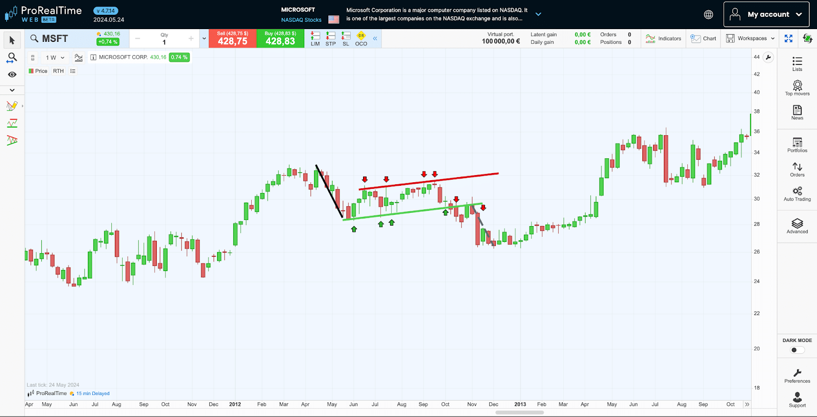
13. The ascending triangle
The ascending triangle is a pattern that resembles a right-angle triangle, consisting of a horizontal resistance level and a bullish oblique support level.
This pattern indicates a build-up of buying pressure, characterized by the price making higher lows, which suggests growing optimism despite the market’s current resistance to new highs. This setup typically reflects not uncertainty, but rather anticipation of a bullish breakout as the pattern nears its apex.

In this ProRealTime Web Platform Chart example, the NASDAQ COMPOSITE Index is captured forming an Ascending Triangle. It is confined by a rising bullish support level (in green) and a steadfast horizontal resistance (in red). Upon breaking out from the top of the triangle, the Index typically exhibits a bullish thrust.
14. The descending triangle
The descending triangle is a consolidation pattern that resembles a right-angle triangle consisting of a horizontal support level and a bearish oblique resistance level.
This pattern often indicates a bearish outlook, reflecting pressure from sellers as they repeatedly push prices down to a consistent support level, despite lower highs achieved after each rebound. This setup suggests a weakening in buying force, hinting at a potential bearish breakout.

15. The rounding bottom
The rounding bottom is a bullish reversal pattern that takes the shape of a “U” once it reaches a support level.
This chart pattern indicates a gradual shift in the power relationship between buyers and sellers. Initially, there is a slowdown in the downtrend, which is followed by a bullish reversal that gains strength over time.

This chart pattern demonstrates a gradual reversal of the power relationship between buyers and sellers with a slowdown of the uptrend followed by a downturn that gets stronger every hour.
If price declines and rebounds aren’t gradual but sudden, the pattern is described as a V bottom.
16. The rounding top
The rounding top is a bearish reversal pattern that resembles an inverted “U” once it reaches a resistance level.
This chart pattern shows a gradual reversal of the power relationship between buyers and sellers with a slowdown in the uptrend followed by a downturn that gets stronger over time.

If the rise and correction of prices are not gradual but sudden, the figure is described as V top.
17. Head and shoulders
Head and shoulders is a bearish reversal pattern consisting of three consecutive peaks, with the central peak (the head) rising slightly over the two peaks (the shoulders) to either side.
This chart pattern demonstrates a gradual inversion of the power relationship between buyers and sellers with the uptrend slowing down, meaning that the second shoulder does not manage to exceed the last high recorded by the head.

18. Inverse head and shoulders
The inverse head and shoulders is a bullish reversal pattern that consists of three consecutive troughs with the central trough (the head) sinking lower than the two troughs to either side (the shoulders).
This chart pattern shows a gradual reversal of the power relationship between buyers and sellers with the downward trend slowing down, meaning that the second shoulder does not manage to go lower than the last low recorded by the head.

19. The cup with handle
The cup with handle is a bullish continuation pattern that consists of two consecutive troughs (a large one followed by a small one).
This chart pattern indicates increasingly strong pressure to buy once the stock reaches the resistance level. The first time the stock reaches the resistance level, prices fall sharply, enough to form the large trough, i.e., the cup. The second time, prices dip only slightly to form the small trough, i.e., the handle of the cup. And the third time, the resistance level finally gives way and the stock trends upward.

20. The inverted cup and handle
The inverted cup and handle is a bearish continuation pattern that consists of two consecutive peaks (a large one followed by a small one).
This chart pattern indicates increasingly strong pressure to sell once the stock reaches the support level. The first time the stock reaches the support level, prices rise sharply, enough to form the large peak, i.e., the cup. The second time, prices rebound only slightly to form the small peak, i.e., the handle of the cup. And the third time, the stock finally breaks through the support level and then trends downward.

21. The diamond top
The diamond top is a bearish reversal pattern that consists of an ascending bevel traced on the high points, with a descending bevel beneath, traced on the low points, the two bevels forming a diamond.
This chart pattern shows an uncertain phase in the market during which volatility increases with new highs, then decreases with lower highs. Once the stock exits the diamond from the bottom, prices drop.

22. The diamond bottom
The diamond bottom is a bullish reversal pattern that consists of an ascending bevel traced on the low points, with a descending bevel beneath, the two bevels forming a diamond.
This chart pattern reflects a uncertain phase in the market during which volatility increases with new lows, then decreases with lower lows. Once the stock exits the diamond from the top, prices increase.
Comparison table of Chart Patterns
| Chart pattern | Type | Signal |
|---|---|---|
| Double top | Reversal | Bearish |
| Double bottom | Reversal | Bullish |
| Range | Consolidation | Neutral |
| Bullish canal | Continuation | Bullish |
| Bearish canal | Continuation | Bearish |
| Bullish flag | Continuation | Bullish |
| Bearish flag | Continuation | Bearish |
| Descending bevel | Consolidation | Neutral |
| Ascending bevel | Consolidation | Neutral |
| Bullish pennant | Continuation | Bullish |
| Bearish pennant | Continuation | Bearish |
| Symmetrical triangle | Consolidation | Neutral |
| Ascending triangle | Continuation | Bullish |
| Descending triangle | Continuation | Bearish |
| Rounding top | Reversal | Bearish |
| Rounding bottom | Reversal | Bullish |
| Head and shoulders | Reversal | Bearish |
| Inverse head and shoulders | Reversal | Bullish |
| Cup with handle | Continuation | Bullish |
| Inverted cup and handle | Continuation | Bearish |
| Diamond top | Reversal | Bearish |
| Diamond bottom | Reversal | Bullish |
Chart patterns are rarely perfectly geometric. Therefore, it can take a little time and practice to be able to identify them.
To teach yourself to trade the most popular chart patterns with no risk at all, consider using one of the best trading simulators.

Maxime holds two master’s degrees from the SKEMA Business School and FFBC. As founder and editor-in-chief of NewTrading.fr, he writes daily about financial trading.