MACD Indicator: What It Is and How to Read It


The MACD is one of the most commonly used technical indicators. But many traders either misuse it or expect too much from it.
At its core, the MACD shows momentum shifts. Built from moving averages, it helps you see if a trend is strengthening, weakening, or possibly reversing.
In this guide, We’ll dive into:
- How the MACD actually works
- What its signals mean—and what they don’t
- Practical MACD trading strategies
Let’s get started.
The MACD is a momentum and trend-following indicator built from two exponential moving averages: one short (12 periods), one long (26 periods).
It helps traders spot shifts in momentum and identify potential entry and exit points, but only when used in context.
The MACD line, signal line, and histogram each offer clues about whether a move is strengthening, stalling, or reversing. Like any technical indicator, MACD won’t guarantee results. Even with solid analysis, it can still lead to losing trades.
What is the MACD?
The MACD is a popular indicator that helps traders spot changes in momentum and trend direction.
MACD stands for Moving Average Convergence Divergence. the MACD is based on exponential moving averages.
It’s based on two exponential moving averages, and it tracks how far apart they are. When those averages move closer together or farther apart, it can signal a shift in momentum.
Gerald Appel created the MACD in the 1970s. Most trading platforms display it in a separate panel below the price chart.

The MACD uses exponential moving averages (EMAs) because they respond faster to recent price changes than simple moving averages (SMAs). This makes the MACD more sensitive to momentum shifts — which is exactly what it’s designed to track.
Understanding the MACD Indicator

The MACD has three main components:
- MACD line: The difference between two exponential moving averages — a short-term (12 periods) and a long-term (26 periods).
- Signal line: A 9-period EMA of the MACD line. It smooths things out and helps highlight when momentum might be changing direction.
- Histogram: Shows the distance between the MACD line and the signal line. When the bars grow, the lines are moving further apart. When they shrink, the lines are getting closer together.
These three parts work together to show what momentum’s doing, and how fast it’s changing. Now let’s break down how the MACD is built, and what traders actually do with it.
MACD Trading Strategies
The first thing most traders look for with the MACD are “Crossovers”.
When the MACD line crosses above the signal line, it’s often seen as a buy signal.
When it crosses below, it can point to a potential sell.
But that’s just scratching the surface — the MACD has more to say than just “buy here, sell there.”
What the MACD line tells you
Since the MACD line tracks the distance between two moving averages, its value can be either positive or negative.
The indicator plots this around a horizontal line at zero, often called the baseline.
This baseline helps traders see whether short-term momentum is stronger or weaker than the long-term trend.
- When the MACD line is above zero, it suggests bullish momentum.
That’s because the short-term EMA (12 periods) is above the long-term EMA (26 periods). In other words, recent prices are higher on average than they’ve been over a longer window. This often happens during upward trends.
- When the MACD line is below zero, it points to bearish momentum.
This means the short-term EMA has dropped below the long-term one. Recent prices are averaging lower than the longer-term trend. You’ll usually see this when the market is drifting down.
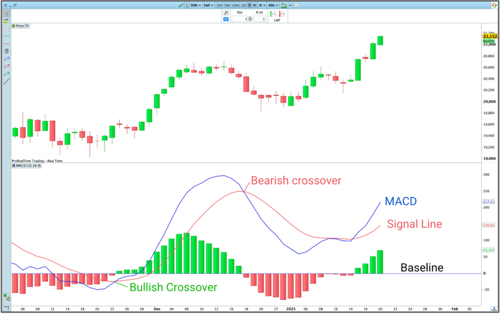
MACD crossovers
The MACD doesn’t just show direction. It tells you how momentum is shifting, whether a move is gaining strength or starting to run out of steam.
The MACD line’s position relative to the signal line — which is just a short moving average of the MACD — can give you more insight into how momentum is shifting.
Traders watch these crossovers closely, especially when momentum is building or fading.

To get that read, look at two things:
- Is the MACD above or below zero?
- Is it above or below the signal line?
Together, these show whether price is rising or falling — and whether that move is speeding up or slowing down.
| MACD value | vs. Signal line | What it suggest |
|---|---|---|
| Above zero | Above signal | Price is rising, and momentum is accelerating |
| Below signal | Price is still rising, but momentum is slowing | |
| Below zero | Above signal | Price is falling, but the drop is slowing down |
| Below signal | Price is falling faster — momentum is accelerating |

Same crossover, different story
A bullish MACD crossover doesn’t always mean the same thing. Context matters — a lot.
Let’s say the MACD crosses above the signal line. That could mean two very different things depending on the trend.
If the overall trend is up, that crossover might signal the start of a new push higher. Buyers are stepping back in, and momentum is picking up. Traders often see this as a chance to ride the next leg of the trend.
But if the market’s been in a clear downtrend? That same bullish crossover might just be a bounce. A brief recovery before the selling pressure returns. In this case, it’s less about jumping in — and more about recognizing a potential trap.
It works the other way around too.
A bearish crossover in a strong downtrend? That might signal the next wave of selling. But in an uptrend, it could just be a pullback, a pause, not a reversal.
That’s why it’s risky to treat every crossover as a buy or sell signal on its own. The MACD can show you when momentum is shifting. It’s up to you to figure out what direction the market was already moving.
The distance between the MACD line and the signal line (aka the histogram)
Most traders use the MACD to track trends. But the histogram, which measures the distance between the MACD line and its signal line, can also help spot momentum extremes.
Each bar shows how far apart those two lines are.
When that distance hits unusually high levels, it can signal that the market is moving too fast.
- If the histogram reaches a high above past peaks, it may point to overbought conditions.
- If it drops well below past lows, it could suggest oversold pressure.
These extremes often lead traders to take profits. Some may even look for countertrend setups, though that’s a riskier play.

As the histogram touches a historical resistance level (red horizontal line), the market pauses and pulls back for four weeks before continuing its uptrend — ProRealTime Charts
MACD Divergences
MACD divergences happen when the MACD line is no longer moving in sync with the price.
A bearish MACD divergence occurs when price makes a new high, but the MACD line doesn’t.

This usually shows up during an uptrend and suggests that buying momentum is starting to fade. It can be an early warning that the trend is losing strength — and that a potential reversal might be on the way.
A bullish MACD divergence occurs when price makes a new low, but the MACD line doesn’t.

This typically happens during a downtrend and suggests that selling momentum is starting to fade. It can be an early sign that the trend is weakening, and that a potential reversal to the upside may be coming.
In his book Technical Analysis: Power Tools for Active Investors, Gerald Appel — the creator of the MACD — even outlines full trading systems based entirely on MACD signals.
Pros and cons of the MACD indicator
Like most popular indicators, the MACD is widely used for a reason — but that doesn’t mean it’s foolproof. It’s easy to read and works across timeframes, but it’s not a signal generator you can blindly follow. Used the right way, it can help you build structure into your trading decisions.
| Advantages | Drawbacks |
|---|---|
| Easy to interpret, even for beginners | Can produce frequent false signals in choppy markets |
| Works on all timeframes and assets | Often gives mixed signals when momentum stalls |
| Useful for spotting momentum shifts | Lags behind price due to its reliance on moving averages |
Final thoughts
The MACD isn’t a crystal ball. It won’t predict what price will do next — and it’s not meant to.
What it does well is help you spot when momentum shifts. It gives structure to your process, especially when you use it with other tools like price action or volume.
The key is context. Used on its own, the MACD can lead you into choppy setups. But as part of a system you’ve tested and trust, it can help you make more disciplined trading decisions.
Want to know if MACD fits your strategy? Backtest it. Try it in a demo.
Just remember, it’s not a magical indicator. It won’t give you a statistical edge by itself. But it can help you build clear, rules-based trading strategies that keep emotions in check.
FAQ
MACD Formula and Settings
The MACD indicator is calculated using exponential moving averages (EMAs):
- MACD Line = EMA (12-period) minus EMA (26-period).
(Shows you momentum.) - Signal Line = 9-period EMA of the MACD line itself.
(Helps confirm shifts in momentum.) - Histogram = MACD line minus the Signal line.
(Visualizes momentum acceleration and deceleration.)
The MACD usually defaults to these settings (12, 26, 9). Platforms calculate it from closing prices, but you can customize the parameters to match your trading style.

Is the MACD a profitable indicator?
Not on its own.
Backtests show that basic MACD strategies — like trading every crossover — don’t offer a strong enough statistical edge to be profitable over the long term.
But that doesn’t make it useless.
What the MACD does well is give structure. It helps traders follow a consistent process for entering and exiting trades, which can reduce emotional decision-making. That’s why many traders use it as part of a broader system, often combined with price action, volume, or trend filters.
So no — the MACD won’t magically make your strategy profitable. But used right, it can make your decision-making clearer.
What’s the best timeframe for using the MACD?
There isn’t one. That’s the point.
The MACD works on pretty much any timeframe — from short bursts like 1-minute or 5-minute charts to longer-term setups like daily or weekly charts.
That flexibility makes it useful across different trading styles. Scalpers and day traders use it to catch quick momentum shifts. Swing traders and position traders rely on it to spot broader trend changes or key turning points.
It’s not about which timeframe is best. It’s about making sure the signals you’re looking at match the style you’re trading
MACD vs. RSI: What’s the difference?
MACD and RSI are two of the most popular trading indicators out there. But even though they’re often used together, they’re fundamentally different.
The RSI (Relative Strength Index) is bounded from 0 to 100. That makes it ideal for spotting clear extremes—like when a market is potentially overbought or oversold.
The MACD, on the other hand, isn’t bounded at all. It moves freely above and below a baseline (zero), making it useful for tracking momentum and trend strength rather than absolute extremes.
That’s why many traders use them together:
- MACD to confirm if the trend is bullish or bearish.
- RSI to find possible reversal points, entries, or exits.

Maxime holds two master’s degrees from the SKEMA Business School and FFBC. As founder and editor-in-chief of NewTrading.fr, he writes daily about financial trading.


7 Popular Swing Trading Strategies with Practical Examples


The Most Popular Chart Patterns in 2026